Fixing unexpected linebreak on single selects #512
Conversation
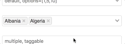
What
---
- Hiding the search input field if the component is in the single value
option.
- Making the search input field full width if no options are selected in
	either single or multi select mode.
- Shrinking it to width auto if there are selected entries in multi
	mode.
Why
---
The component broke into two lines when selecting a a value in single
mode, because an empty, non-interactable input field was pushed down to
the next row if the selected entry had a long label.
 eriknygren
force-pushed
the
fix-unexpected-wrapping-on-single-select
branch
from
eriknygren
force-pushed
the
fix-unexpected-wrapping-on-single-select
branch
from
c624d55 to
970d1da
Compare
|
Looks good! Will test asap. |
|
It looks awesome! Nice fix @eriknygren |
|
Great, thanks guys! Let me know if you need anything more from me. Happy to help |
|
I think this is the same problem as #225. |
|
bump, would love to go back to pointing to the master branch on my project 😎 @sagalbot any idea when you'll have some time to test this? anything I can do to help? |
|
@eriknygren agreed! I'm way behind over here. I know I won't have time today to checkout the branch, but if I recall correctly on my quick review I remember noticing some issues with Could you have a look and let me know what you find? Maybe I'm not remembering and this can be merged right now. I also have to get the |
|
@sagalbot can't see any regressions regarding
Attached a quick video of how it interacts in multiple mode above, looks good to me but you know the component better than me! |

|
@sagalbot first of all, I really appreciate this beautiful plugin, congrats for your work, it's very useful. I'm using it in an NGO project. Right now I'm experiencing this issue as the other ones commented above. I understand that is just a cosmetic issue, but It would be helpful if you guys can review this pull request and merge into master. Thanks for all. 👍 |
|
bump ;) Merging this pull request will improve single selections a lot. Leave it as current state would be odd |
|
Would be great to have this merged in, i'm using a lot of these selectors in a project currently and the layout is suffering 😩 Keep up the great work though! |
|
@tursics @aabraham88 @Lovatt as a temporary workaround you could always update your dependency to point to this PR until it's merged. That's what I'm doing. So in your package.json go: Clearly we all prefer not being on a fork, but just thought I'd mention it. |
|
Thanks @eriknygren, i didn't know you could do that! 😌 |
|
@eriknygren i tried your branch in my project, it did indeed fix the formatting issues, but it looks like it breaks search |
@Lovatt hmm, in what way? I'm not convinced that's related to this change. But I'd like to confirm, thanks. Edit:
Seems fine, I don't believe your issue is linked. |

src/components/Select.vue
Outdated
| @@ -213,6 +214,16 @@ | |||
| .v-select.unsearchable input[type="search"]:hover { | |||
| cursor: pointer; | |||
| } | |||
| .v-select input[type="search"].hidden { | |||
| display: none; | |||
There was a problem hiding this comment.
In my testing, display: none can mess up the vertical alignment of the clear button and the dropdown arrow. Perhaps we consider the following instead, as they preserve the height of the input element, and the vertical alignment of the other elements?
width: 0px;
padding: 0;There was a problem hiding this comment.
Good shout @stevenharman , will update
|
Just discovered the same issue. Any hope for getting this merged 🔜? For what it's worth, the following hack seems to work around the issue... for now. Maybe? .v-select.single .selected-tag + input[type="search"] {
padding: 0;
width: 0px !important;
} |
|
@stevenharman can you provide steps to reproduce? I have a couple hours free this morning and would love to get this one merged. |
|
@sagalbot Sure. You can actually see it in action on the demo pages: https://codepen.io/sagalbot/pen/qxbPLY Go there in Firefox/Chrome, and then turn on the responsive design dev tool. Shrink the viewport down to less than ~380px wide and you'll see the following:
|

What
---
- Removing hidden class from single inputs when the dropdown is hidden.
- Changing from `display:none` to zero width when hiding the input.

Why
---
Because the user will be typing for another element if reopening the
dropdown, which we need to allow.
|
@sagalbot just noticed an issue where the input was incorrectly hidden if the user re-opens the dropdown after already having a selected item. I added another commit to fix that, hopefully it’s fairly clear what’s going on. Let me know if you want me to squish the commits or something. Also, added your suggestion @stevenharman. |
|
Nice catch @sagalbot. Looking forward to this being merged and released! Thanks! |
|
Or, rather... nice catch, @eriknygren. And @sagalbot is that sufficient to reproduce, test the fix, and get this merged and released? Thanks! |
|
bump @sagalbot |
|
@sagalbot @eriknygren The more I play with these changes, the more I'm certain that we should also be "hiding" the input for a multi-select, just as we do for single select. That is, remove the check for inputClasses() {
return {
hidden: !this.isValueEmpty && !this.dropdownOpen,
shrunk: this.multiple && !this.isValueEmpty,
empty: this.isValueEmpty,
}
}Everything still seems to work as expected, with the added benefit of not adding a second, blank, line to multi-selects. Possibly related - one way to fix this would be to use a flex-box layout for the selected options, input, loading, and clear buttons. So two questions:
|
|
Thanks @stevenharman I'll add your suggestion and try it out later today |
|
@stevenharman yes! Flex based layout has been on my must-do list for months. |
`flex-grow` will stretch the input to take all remaining space, but We
need to ensure a small amount of space so there's room to type input.
We'll set the input to "hidden" (via width: 0) when the dropdown is
closed, to prevent adding a "blank" line (see:
sagalbot#512). In that case, the
flex-grow will still stretch the input to take any available space, on
the same "line."

This really needs sagalbot#512 to
work best.
|
@stevenharman I took your suggestion for a spin, it fixes the bug you've mentioned, and works in all but one scenario. Because the multiple select leaves the input on loosing focus the behaviour is a bit "out of the norm" when this occurs. Hopefully this gif explains what I mean:
I'd vote for leaving multi select to another pull request. I think this can be merged as-is and it'll add value. Then we can think of another solution for the multiple mode. |
|
@eriknygren Sounds good. I feel like much of this can be simplified and solved by #594, which I built with your changes in this PR in mind. Once this PR is merged, I'll revisit #594 and tweak it accordingly. |
|
Perfect, thanks @stevenharman. Let's get this show on the road 🛣 |
|
Thanks for the patience and the great work @eriknygren!! |
`flex-grow` will stretch the input to take all remaining space, but We
need to ensure a small amount of space so there's room to type input.
We'll set the input to "hidden" (via width: 0) when the dropdown is
closed, to prevent adding a "blank" line (see:
sagalbot#512). In that case, the
flex-grow will still stretch the input to take any available space, on
the same "line."

This really needs sagalbot#512 to
work best.
|
Excellent work guys! 🎊 Do you know when this will come available in a release? Thanks in advance. |
|
My pleasure, thanks for taking the time and writing this mega useful component! |
|
Hi everyone. Sorry for bother you with this question, but how do I do to update the package with npm to have this fix? Thanks in advance. |
|
@aabraham88 I just managed to add this fix to my project. Here's what I did, I hope it works out for you too. Since the changes have been merged to master, we could pull the master branch using According to #306 if you want to rebuild the dist folder, you need to clone the repo in a separate folder. It won't work if you try to npm run install and build inside the vue-select folder in the node_modules of your project. So, first, I cloned the project into a local directory: That built the project and re-created the dist folder using the latest code from I then copied over the files from the new dist folder over the node_modules/vue-select/dist folder in my project and everything worked fine. This really doesn't feel like the right way to do it but until there's an official release this works fine for me. |
|
Hi @kyrpas I will try your suggestion. Thanks! |
|
@aabraham88 @kyrpas Did you try what I previously suggested? With you current solution @kyrpas you'll loose the fix if you re-download the dependencies |
|
@eriknygren I did see your comment on June 4, then realised your fork is a few commits behind the original master branch and chose to rebuild from master. To be honest, none of the two solutions are ideal but since they're only temporary I'm ok with either one. I see your point though. Your suggestion is more robust. Any idea as to when to expect a new release? Is there anything we can do to help? |
|
I'm also very curious on a release date of a version that includes this patch. When can we expect this? I'll use @eriknygren 's fix in the meantime. |
|
Hi everyone. I had the opportunity to test this in my project, and I think I found a bug. Here is the gif video of the test. I hope you can tell me if I'm doing something wrong or instead is an issue. I just want to say that this issue is not reproducible before the change introduced in this pull request. Thanks! |
|
@aabraham88 I have something similar in my usage, though we do add the pre-loaded value to the "available" list of options when mounting the component. That said, clicking the the dropdown clears the value so the user can search. They can close the dropdown by clicking the |
|
@stevenharman no, in my case it didn't work. As you can see in the video, clicking on the |
|
Ahh, I just realized I also have #594 applied to my app. That outstanding PR is built atop this one, and has a much more versatile and robust layout scheme. I wonder... if you try that branch, do you still see the issue? |
|
Hi there, I'm still seen the unexpected linebreak on single selects.
I'm currently using vue-select v3.1.0 along with bootstrap v4. |

|
@matneves I had the same issue with vue-select v3.1.0 and bootstrap v4. This did it for me in a component that is using vue-select: <template>
<v-select
class="my-select"
//... other options
/>
</template>
<style scoped>
.my-select >>> input.vs__search {
height: 0 !important;
margin: 0 !important;
padding: 0 !important;
}
</style>Note, I'm using vue-loader and the |
|
Hi, The same issue still persists in vue-select 3.10.3. I could solve this for my project with the next CSS properties: .v-select .vs__selected-options{ |
`flex-grow` will stretch the input to take all remaining space, but We
need to ensure a small amount of space so there's room to type input.
We'll set the input to "hidden" (via width: 0) when the dropdown is
closed, to prevent adding a "blank" line (see:
sagalbot/vue-select#512). In that case, the
flex-grow will still stretch the input to take any available space, on
the same "line."

This really needs sagalbot/vue-select#512 to
work best.
Fixes #460
What
option.
either single or multi select mode.
mode.
Why
Before:

After:

Reason for being broken:

The component broke into two lines when selecting a a value in single
mode, because an empty, non-interactable input field was pushed down to
the next row if the selected entry had a long label.
PS not sure if I did something weird with the indentation in the spec file?